You can create scatter plots in Python by using the matplotlib as follows:
import matplotlib.pyplot as plt

plt.scatter(x, y)
plt.show()
Where x and y are lists of numbers or the data points for the plot.
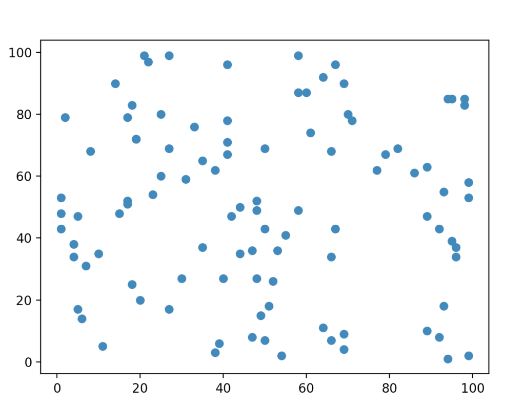
For example, let’s create a scatter plot where x and y are lists of random numbers between 1 and 100:
import matplotlib.pyplot as plt
import random

x = [random.randint(1, 100) for n in range(100)]
y = [random.randint(1, 100) for n in range(100)]

plt.scatter(x, y)
plt.show()
Given randomized x and y data, the scatter plot looks something like this:
Scatter Plots in Python
Generally, scatter plots are used to demonstrate the relationship between two variables. These relationships can be linear, non-linear, positive, negative, strong, or weak.
To create scatter plots for visualizing these relationships in Python, first install matplotlib on your machine.
How to Install Matplotlib in Python
To create a scatter plot, you need to have matplotlib module installed.
If you don’t have it yet, install it by running the following command in your command line:
pip install matplotlib
How to Create a Scatter Plot in Python
To create a scatter plot:
- Specify a group of data points
xandy. - Call
matplotlib.pyplot.scatter(x, y)for creating a scatter plot.
For example, let’s create a scatter plot with 100 random x and y values as the data points:
import matplotlib.pyplot as plt
import random

x = [random.randint(1, 100) for n in range(100)]
y = [random.randint(1, 100) for n in range(100)]

plt.scatter(x, y)
plt.show()
Here is the resulting scatter plot:
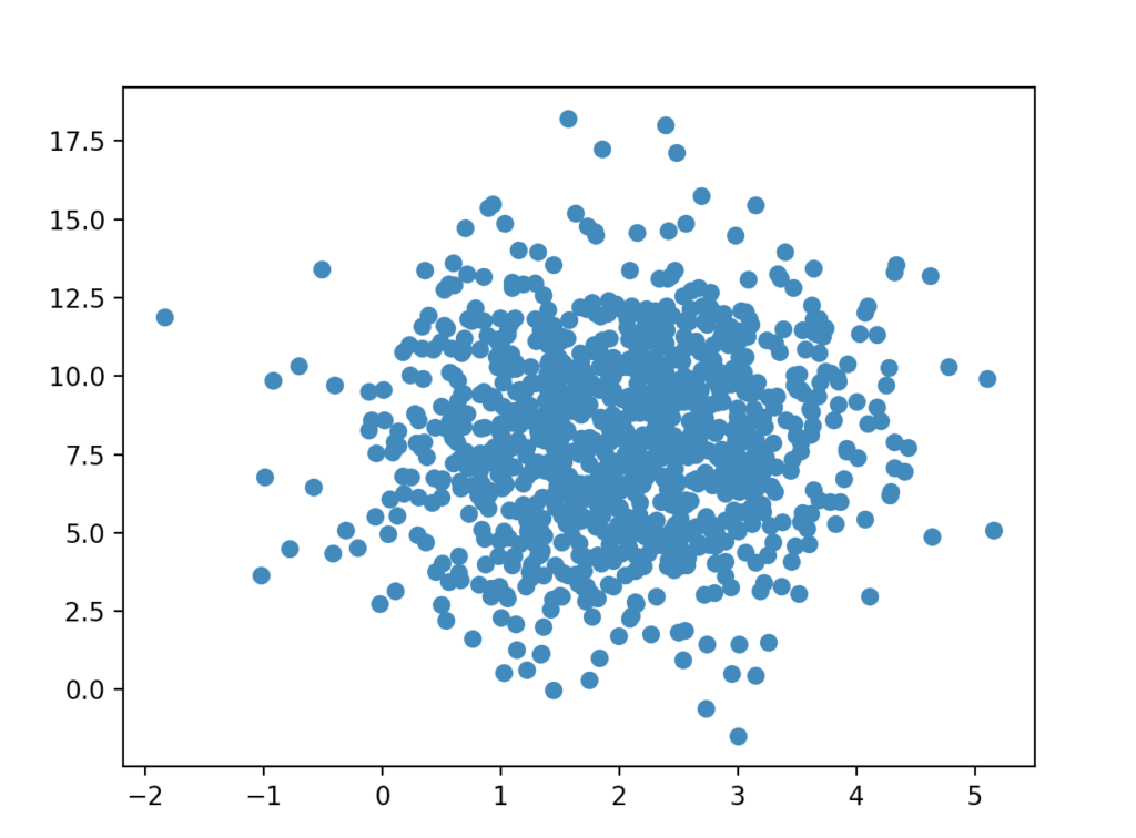
Example—Randomly Distributed Data
This example uses NumPy to generate random data from a normal distribution. Make sure to have NumPy installed on your system:
pip install numpy
Let’s create two lists filled with 100 numbers picked from the normal distribution. Then let’s create a scatter plot from the randomized data:
import numpy
import matplotlib.pyplot as plt

x = numpy.random.normal(2.0, 1.0, 1000)
y = numpy.random.normal(8.0, 3.0, 1000)

plt.scatter(x, y)
plt.show()
- The x data is from a normal distribution where the mean is 2.0 and STD 1.0.
- The y data is from a normal distribution where the mean is 8.0 and STD 3.0.
This means we expect to see the x values centered around 2.0, and y values around 8.0. Also, the y values are going to be spread more than the x values due to greater standard deviation.
Output:
Conclusion
Today you learned how to produce a scatterplot in Python.
To recap, scatter plotting is a useful tool to observe relationships between two variables.
In Python, you can create a scatter plot with matplotlib:
import matplotlib.pyplot as plt
plt.scatter(x, y)
Where x and y are lists of numbers that act as data points.
Thanks for reading. I hope you enjoy it.
Happy coding!