To draw a pie chart in Python, use the matplotlib library’s pie() function.
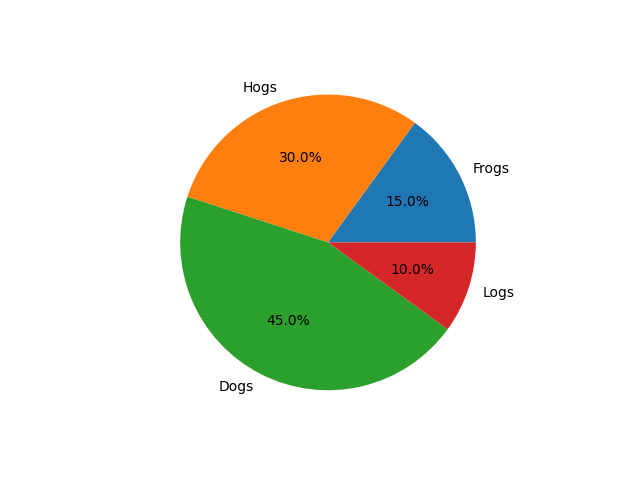
Here’s an example code that produces a pie chart with 4 slices:
import matplotlib.pyplot as plt

# Pie chart, where the slices will be ordered and plotted counter-clockwise:
labels = 'Frogs', 'Hogs', 'Dogs', 'Logs'
sizes = [15, 30, 45, 10]

fig1, ax1 = plt.subplots()
ax1.pie(sizes, labels=labels, autopct='%1.1f%%')

plt.show()
This is a complete guide to plotting pie charts in Python using the matplotlib module.
If you’re not familiar with pie charts or matplotlib, make sure to read the entire guide. On the other hand, if you’re just looking for a quick answer, I’m sure the above code will do.
Pie Charts
A pie chart is a type of chart that is used to visualize and compare data. It shows the proportions or percentages of different categories in a data set, by dividing a circle into slices of different sizes. Each slice of the pie chart represents a category, and the size of the slice represents the proportion or percentage of the data that belongs to that category.

Pie charts are often used to show the distribution of a data set across different categories, and to compare the relative sizes of the different categories.
For example, a pie chart can be used to show the market share of different products in a company, the distribution of different income groups in a population, or the spending patterns of a household.
Pie charts are useful because they provide a visual representation of the data that is easy to understand and interpret. However, they are not always the best choice for data visualization, because they can be difficult to read when the data has a large number of categories, or when the differences between the categories are small. In these cases, other types of charts, such as bar charts or stacked bar charts, may be more effective at conveying the information in the data.
Plotting a Pie Chart with Python (MatPlotLb)
In this section, you learn how to plot a pie chart in Python using the matplotlib module which is a popular data science and mathematics module for Python developers.
What Is MatPlotLib?
matplotlib is a popular plotting library for Python that provides a range of functions for creating and customizing visualizations of data. It is widely used in the scientific Python community, and is well-suited for creating 2D plots of arrays, such as line plots, scatter plots, and histograms.
matplotlib has a rich set of features that allow you to customize your plots in many ways. For example, you can control the appearance of the axes, the grid lines, the figure size and resolution, the line styles and colors, and many other aspects of the plot. You can also add text and annotations to the plot, and create subplots and other complex layouts.
matplotlib is designed to be used with the NumPy library, which provides support for working with arrays and matrices of data. This makes it easy to create plots of data that is stored in NumPy arrays, and to customize the plot by manipulating the arrays using the functions and methods provided by NumPy.
Overall, matplotlib is a powerful and flexible tool for data visualization in Python, and is a good choice for creating a wide range of plots and visualizations of data.
Install MatPlotLib
To install the matplotlib library to your computer using the command line, you will need to use the pip command, which is the default package manager for Python.
pip is included with Python, so if you have Python installed, you should already have pip too. If you have an old version of Python, you may need to install pip separately. Make sure to follow this guide.
To install matplotlib using pip, open a command prompt or terminal window, and type the following command:
pip install matplotlib
Also, if you’re running Python 3, make sure to replace pip with pip3 in the command.
Drawing Pie Charts with MatPlotLib
To draw a pie chart in Python, you can use the matplotlib library and its pie() function.
For example:
import matplotlib.pyplot as plt

# Pie chart, where the slices will be ordered and plotted counter-clockwise:
labels = 'Frogs', 'Hogs', 'Dogs', 'Logs'
sizes = [15, 30, 45, 10]

fig1, ax1 = plt.subplots()
ax1.pie(sizes, labels=labels, autopct='%1.1f%%')

plt.show()
This piece of code creates a pie chart with the given labels and sizes, and displays the percentage value for each slice on the chart.
You can customize the chart further by setting various options for the pie() function, such as the starting angle, the colors of the slices, and more.
Customize the Pie Chart
To customize the pie chart, you can use various optional arguments for the pie() function in the matplotlib library.
Here are some of the customization parameters you can specify:
-
startangle: This argument specifies the starting angle of the pie chart, in degrees. For example, the settingstartangle=90will rotate the pie chart by 90 degrees, so that the slice at the top is rotated to the right by 90 degrees. -
colors: This argument specifies the colors to use for the slices in the pie chart. You can specify a single color, a sequence of colors, or a color map. For example, the settingcolors=['r', 'g', 'b']will use the colors red, green, and blue for the slices respectively. -
explode: This argument specifies which slices to “explode” (move away from the origin) from the pie chart. You can specify a sequence of numbers, where each number specifies the distance to move the corresponding slice out from the center of the pie chart. For example, the settingexplode=[0, 0, 0.1, 0]will move the third slice (corresponding to the “Dogs” label) out by 10% of the pie radius.
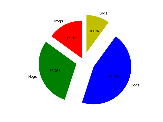
Here’s an example that customizes the pie chart:
import matplotlib.pyplot as plt

# Pie chart, where the slices will be ordered and plotted counter-clockwise:
labels = 'Frogs', 'Hogs', 'Dogs', 'Logs'
sizes = [15, 30, 45, 10]

# Set the starting angle to 90, and the colors to red, green, and blue
fig1, ax1 = plt.subplots()

# Move the slices from the origin by fractions relative to the radius of the circle
explode = [0.1, 0.2, 0.3, 0.25]
ax1.pie(sizes, labels=labels, autopct='%1.1f%%', startangle=90, colors=['r', 'g', 'b', 'y'], explode=explode)

plt.show()
Output:
Summary
Today you learned how to produce a pie chart in Python using matplotlib.
To take home, matplotlib is a popular Python library used by the scientific Python community. It can produce plots, graphs, and comes with useful tools for data scientists. To use matplotlib, you need to install it with pip, for example. Then you can use the pie() function to produce a pie chart for a given set of labels and data.
Thanks for reading. Happy coding!