
AI logo-making tools have come as a blessing for those who aren’t well-versed in graphic design technicalities but want to create compelling logos for their brands and businesses.
Leveraging advanced artificial intelligence technologies, and learning from vast amounts of design data, these logo makers simplify the design process. They create premade logo design templates that you can customize to create logo designs that are as close to your ideal brand identity as you want.
But there are tricks to maximize the efficiency of these logo makers, and this article is going to share a few of them with you.
So here it goes.
Disclaimer: This is a sponsored post written in collaboration with an AI logo maker firm, LogoDesign.net.
#1 Choose the right AI logo maker
It seems redundant to start with this advice — of course, you’re going to choose the best logo maker out there — but the truth is, there’s a world of difference between what’s best and what’s right.
The top-performing AI logo maker tool may be great but it may not align with your unique business goals. For example, if you want a very specific look for your logo, the top design tool may be full of generic ideas that you may not like. In such a case, you want to explore logo makers with expertise in specific industries.
So even if you think it’s redundant, it’s necessary to start outlining your needs so you can narrow down your logo maker choices. Start by asking yourself some questions:
- What kind of a logo design you’re looking for? Icon-based or just text?
- Will you be happy with a premade template or do you want human insight into it?
- What is your design budget?
- Are you looking for a solitary logo or need the whole branding shebang?
These questions will help you prioritize available options so you can start your design journey with more focus.
#2 Evaluate available logo styles
Depending on who you ask, there are as many as 14 unique logo styles to choose from.
Top 7 of these include:
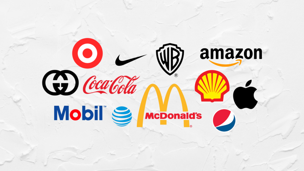
- Combination logos (icons + text): Burger King & PayPal
- Logomarks (only icons): Apple & Nike
- Wordmarks (only words): Disney & FedEx
- Monograms (only letters): BBC & IBM
- Shields/Emblems: UPS & Superman
- Abstract: Pepsi & Slack
- Mascot: KFC & Pringles
Your logo style should match your brand identity and character fully. Monograms, also called letter marks are suitable for brands that have a longer name or a name that’s hard to spell or pronounce. Shields or emblems suit brands that have a historical legacy or that want to establish an air of institution around their brand.
While combination logos are the most popular type of logos you can go for, each has a unique quality and serves a unique purpose. Choose what you think can do the best job for you.
#3 Prefer using symbolic icons
Speaking of combination logos, they are the most prevalent type of logo styles you’ll find on AI logo maker platforms. One reason is their popularity and the other is their efficacy.
Combination logos use the best of both worlds by combining the name of the brand with an icon that symbolizes the brand. When you are DIY-ing your logo design, choose symbolic icons versus descriptive icons.
For example, a fork or knife symbol is pretty descriptive for a restaurant logo but it is also quite literal. It doesn’t leave much to the imagination and may feel too generic. But if you go with a pepper shaker icon or a cooker icon, the message will appear more creative.
#4 Keep your color use simple
Don’t go crazy on your logo combining fifteen different colors together. Choose a simpler color palette so people can remember your logo well. Minimalist logo designs are the easiest to identify, remember, and recall.
So, use a maximum of three colors in your logo design color scheme. We suggest using two as the ideal combo but three isn’t too far off the mark. It gives you enough room to experiment and play with different combinations while still keeping the visual environment clean and tidy.
#5 Consider color psychology
Color psychology is the study of how people feel influenced by colors and use them to interpret the environment around them, form emotional associations, and guide their behavior.
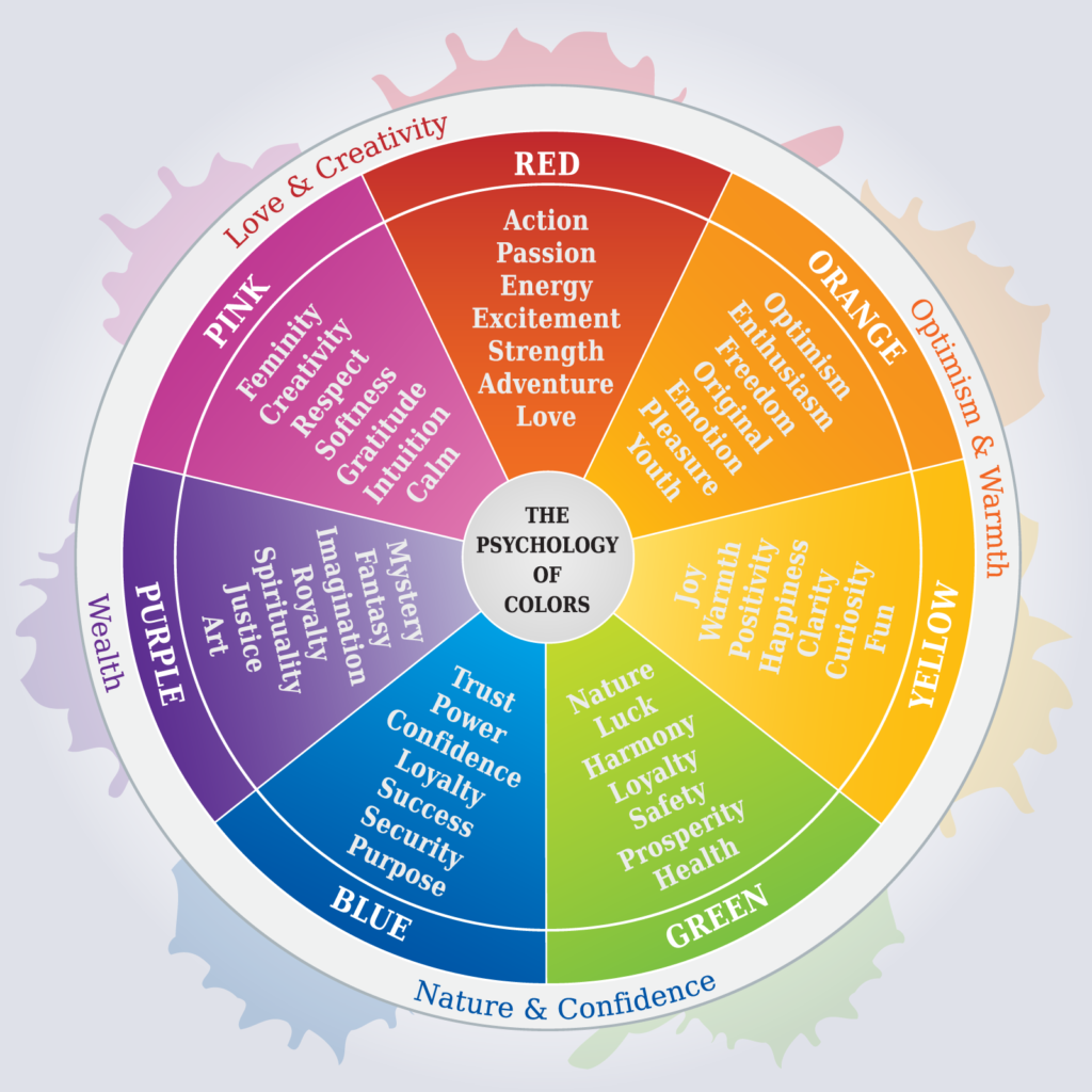
Using color psychology, brands make decisions about the color schemes to choose in their branding and marketing.
They select colors that represent their brand character most closely and encourage users to take specific actions. McDonald’s and other fast food brands, for example, often go with a yellow and red color palette to encourage rapid action, and swift decisions, and to stoke hunger.
When you are making decisions about your own brand’s signature colors, use color psychology as your color guide.
#6 Use fonts wisely
There are around 4 main types of font styles that Adobe has summarized in this article.
These include:
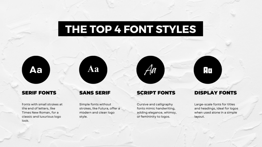
- Serif: These fonts have little lines or strokes at the end of their characters. Times New Roman is a famous serif font. Serif fonts are used to add a classic and luxurious touch to logo designs.
- Sans serif: These are simpler fonts with no serifs (strokes/lines) at the end of individual letters. These are modern, cleaner, and simpler. Futura is a world-famous sans-serif font.
- Script: Script fonts closely mimic natural handwriting. They are usually cursive fonts and calligraphy fonts and are used in logos to convey whimsy, elegance, casualness, and femininity in designs.
- Display: Display fonts are intended to be displayed at a large scale such as titles and headings and can be great for a logo. But don’t mix them with other fonts and only use them in a simple layout.
The trick to choosing the right font for your logo design is readability. Everything, starting from brand identity to target market, stems from there. When you find a logo that’s easily legible and readable, move on to see how well it meshes with your brand identity.
Once again, like color, don’t go overboard with your logo fonts. A pair of two or a mix of three is the best to go with.
#7 Pay attention to balance and proportion
Balance refers to the distribution of elements in your logo design, and proportion is the relationship of size and weight between these elements. Both these factors go hand-in-hand and make the logo look well-balanced and in proportion.
So, as a basic rule, when you are using a combination logo, your icon should be larger than any text in your logo. The same applies to the tagline. It should not be bigger than your brand name in your logo design.
Balance-wise, try to use the smooth approach and choose symmetrical balance in your logos. Symmetrical balance is when both sides of your logo design weigh (and look) equal if you slice your logo in two equal halves.
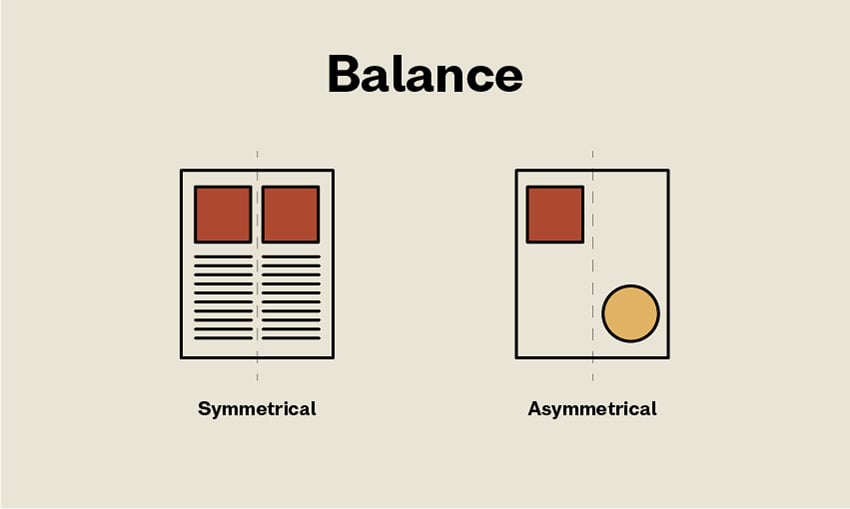
Symmetrical balance looks natural and easy while the other kind — asymmetrical balance — is used when you want a brand identity that’s dynamic, super-charged, and out-of-the-ordinary.
#8 Choose timeless over trendy
Browning through logo templates, look for designs that are classic and timeless. While being on trend may sound like a good idea — having a brand logo that seems well-versed with the pulse of the time — it won’t have a long life.
Trends come and go and if your logo is using trends without anything substantial in the roots, it’ll soon become irrelevant.
So instead of using a retro logo just to look trendy, go with something that feels natural to your brand and its vibe. Elements that follow a clear brand identity, and a design that’s based on a solid vision.
#9 Trust vector formats for maximum scalability
Most AI logo makers use vector-based logo formats to offer users maximum scalability. If you aren’t sure about your logo’s format, look at the file type it is available in. PDF and SVG are common file types for vector images.
Why you should insist on vector files? Because they protect image legibility and quality when the file size is manipulated for marketing purposes. Meaning, that when you shrink your image or enlarge it to suit different visual backgrounds, the logo will retain its shape and quality. It won’t pixelate or appear broken. It’ll look sharp, crisp, and clear no matter the scale.
#10 Buy exclusive rights
This is probably the most important point on the list. AI logo makers usually present the same logo templates to their whole consumer base. It’s entirely possible that many customers will have used the same graphic you’ve just finalized as your business logo design.
To protect your brand identity, we advise you to buy the logo design you’ve customized for your brand. Exclusive rights will guarantee that your logo — in that version — will be yours to use alone and no other entity will be able to claim ownership.
Conclusion
AI logo makers are an incredibly efficient tool to streamline the logo design process and help businesses save a lot of money and time in the process.
However, maximizing the efficiency of these tools comes with a bit of learning and practice. I hope this article will help as the first step in that direction, and you can learn to master DIY logo design with the help of this guide.